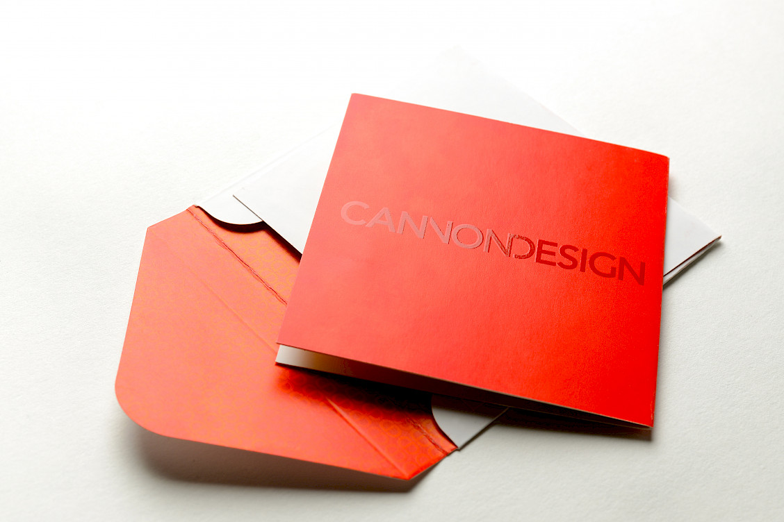
CANNON DESIGN
Adobe Illustrator / InDesign / Premiere
Logos / Branding
2013 - Shanghai, China
Creative Direction, Graphic Design, Print Production: Yasuo Kishibe
Logos / Branding
2013 - Shanghai, China
Creative Direction, Graphic Design, Print Production: Yasuo Kishibe
Adobe Illustrator / InDesign / Premiere
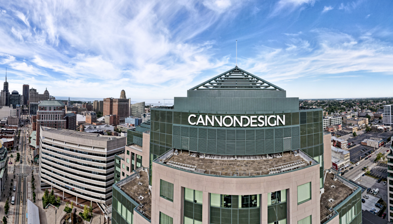
Brand-First Design
Transforming Legacy into Modern Vision
I led a comprehensive brand refresh for CANNON DESIGN, an established architectural firm with nearly 70 years of heritage across 15 offices in the US, Canada, China, and India.
The transformation encompassed logo redesign, refined stationery systems, and strategic revision of corporate vision and mission statements. I developed comprehensive brand guidelines and a manifesto book to maintain consistency across all brand applications.
This project bridged the firm's rich history with contemporary market positioning, creating a cohesive identity that honors their legacy while embracing future gro
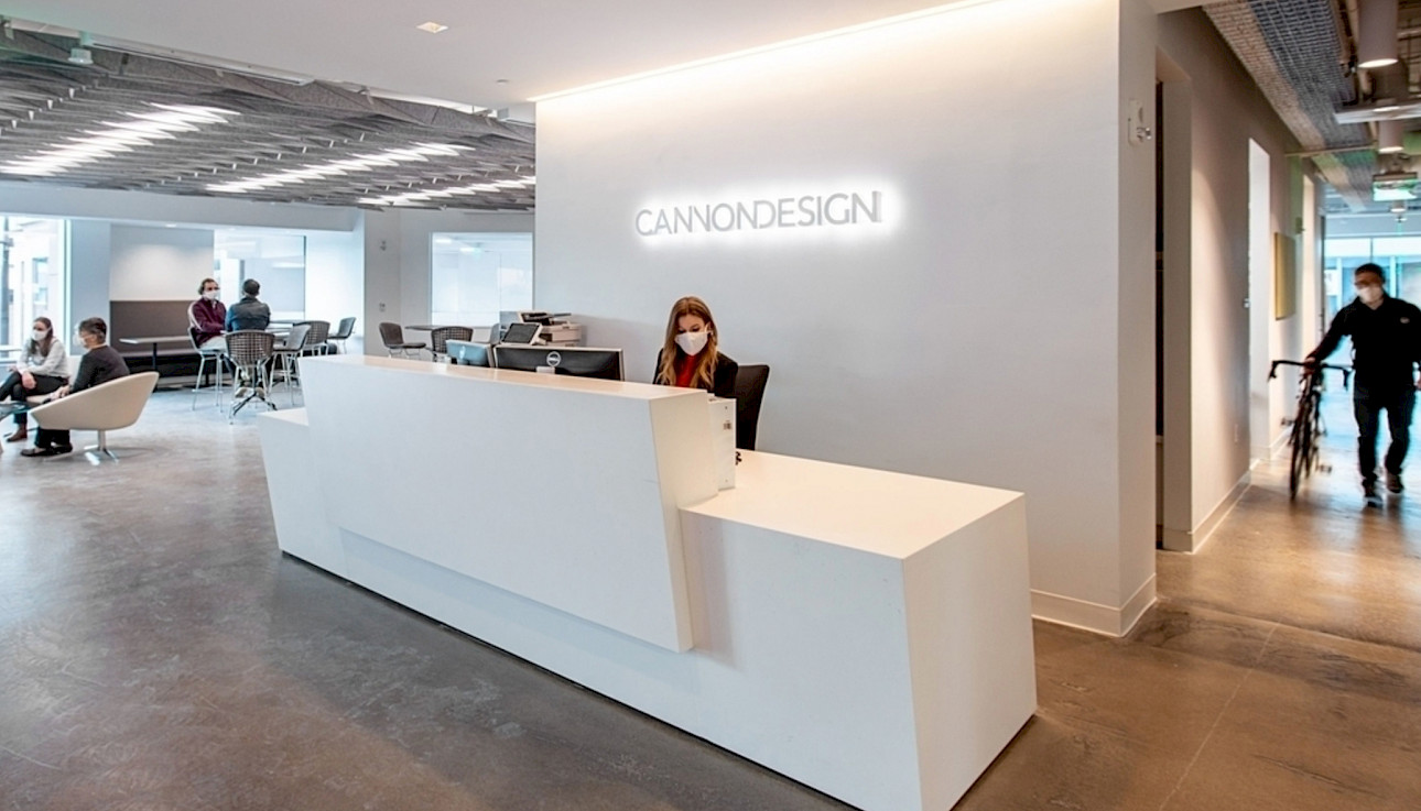
Throughout this revitalization process, the Shanghai team played a pivotal role, acting as the firm's innovative think-tank studio. Their expertise and insights were instrumental in shaping the direction and creative approach of the project, bringing fresh perspectives to the table.
The aim of this comprehensive endeavor was to invigorate the firm's image, ensuring it remains relevant and forward-thinking in the dynamic field of architecture. By embracing change and harnessing the collective talent and global presence of CANNON DESIGN, the brand refresh sets the stage for a new era of growth and success.
![]()
![]()

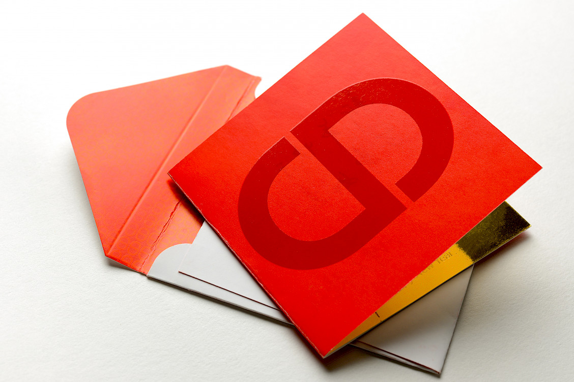
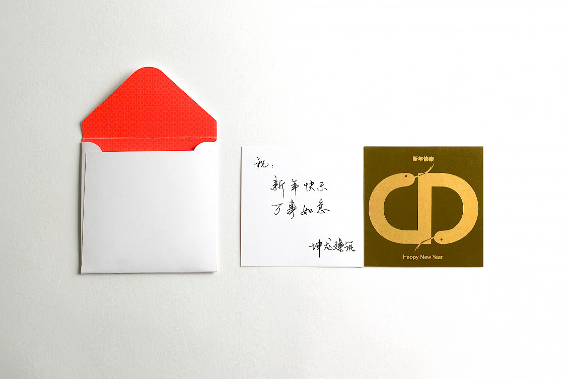
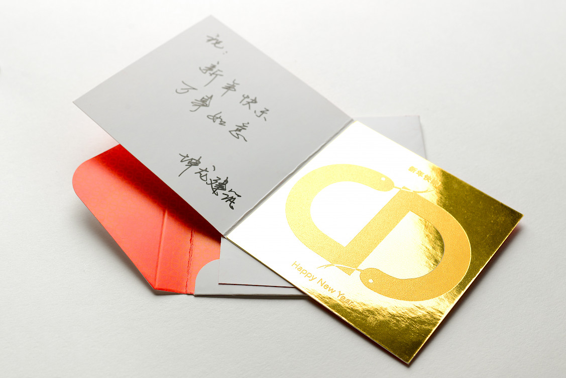
Favicon & Chinese New Year Launch
We designed a custom favicon to perfectly complement the new logo and brand identity.
The rebrand launched during Chinese New Year of the Snake – perfect timing! We celebrated by creating special company New Year cards that showcased the fresh logo and visual identity to our community.
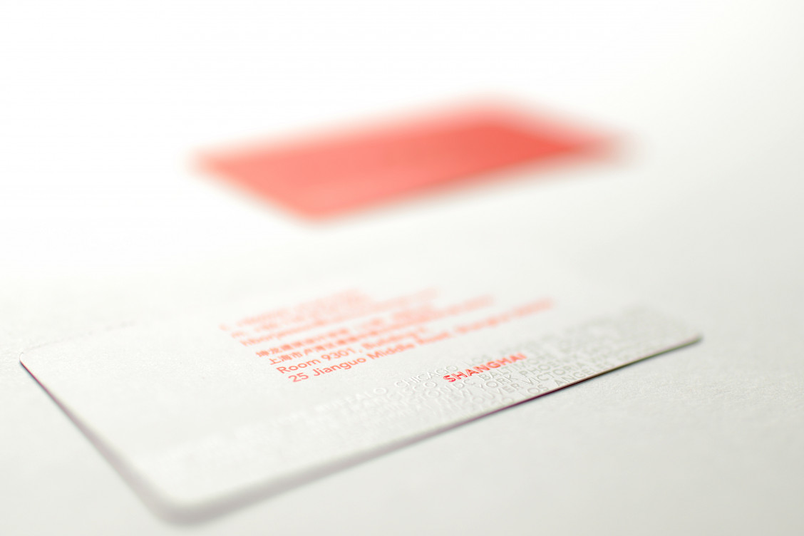
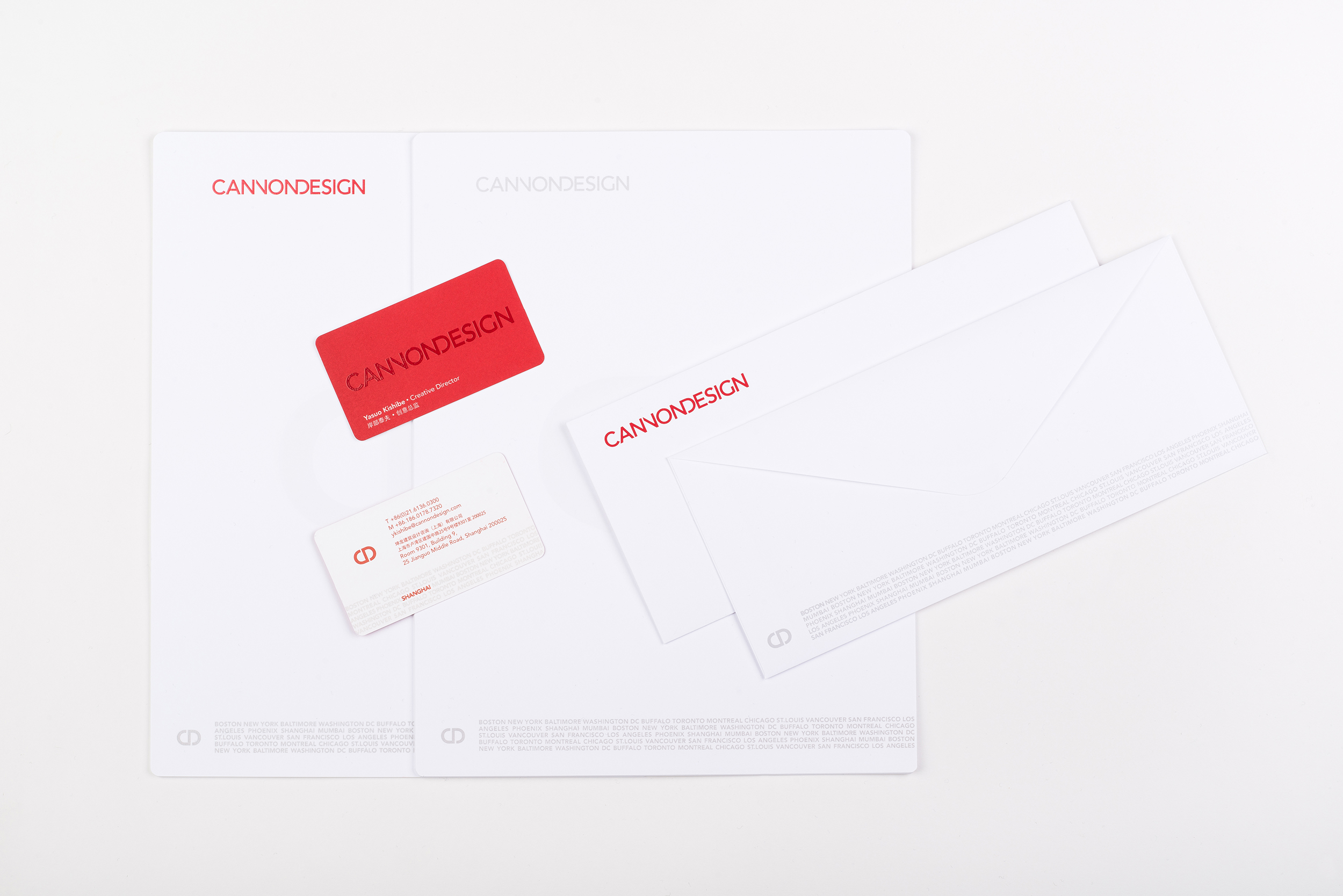
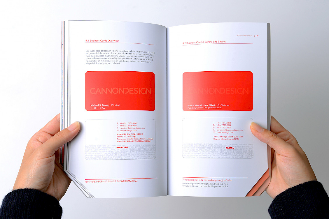
Business Cards / Stationery
The city names create an artistic pattern with UV coating that goes beyond a simple office list. They're designed as a visual texture that reflects our core philosophy: SFMO (Single Firm, Multiple Offices).
Each card highlights its specific office location in red, making it easy to spot that office within their global network while showcasing their unified yet distributed presence.
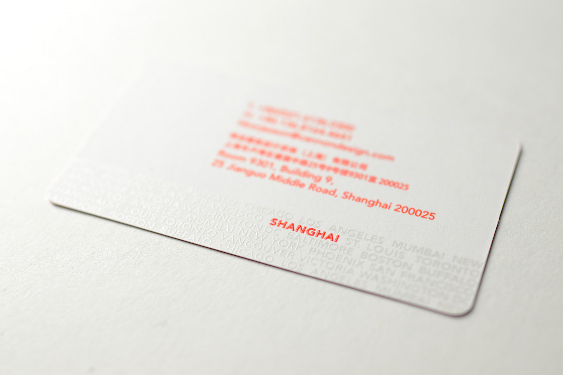
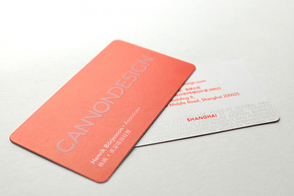
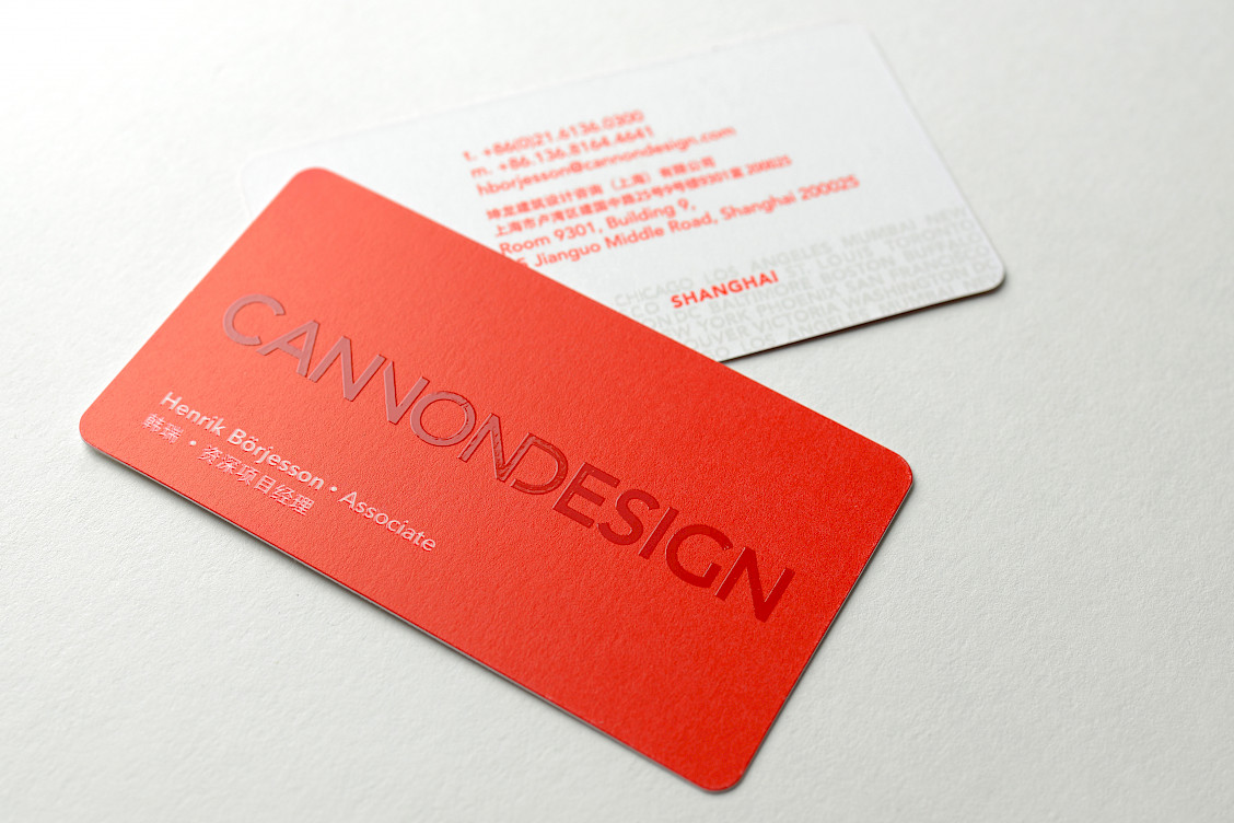
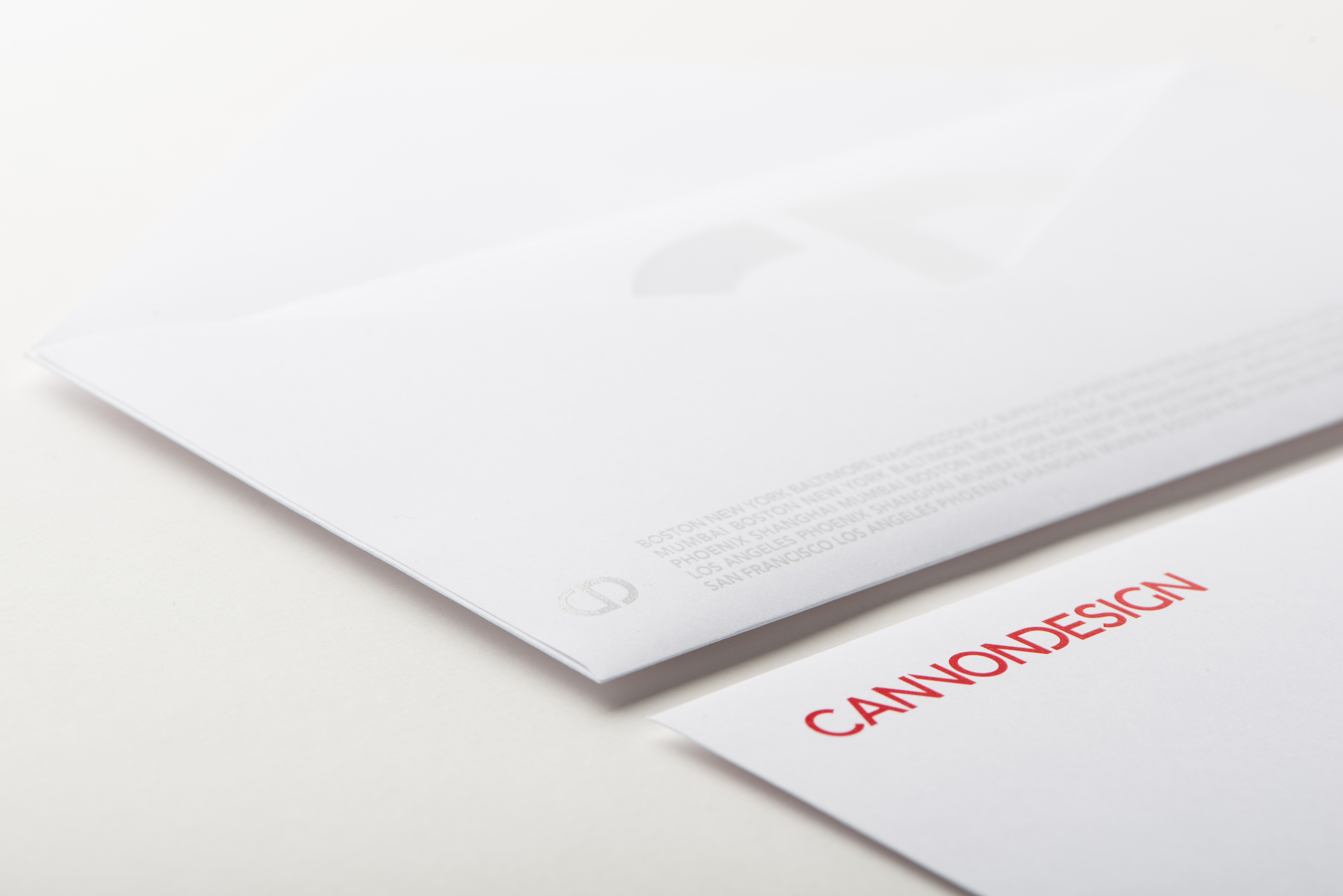
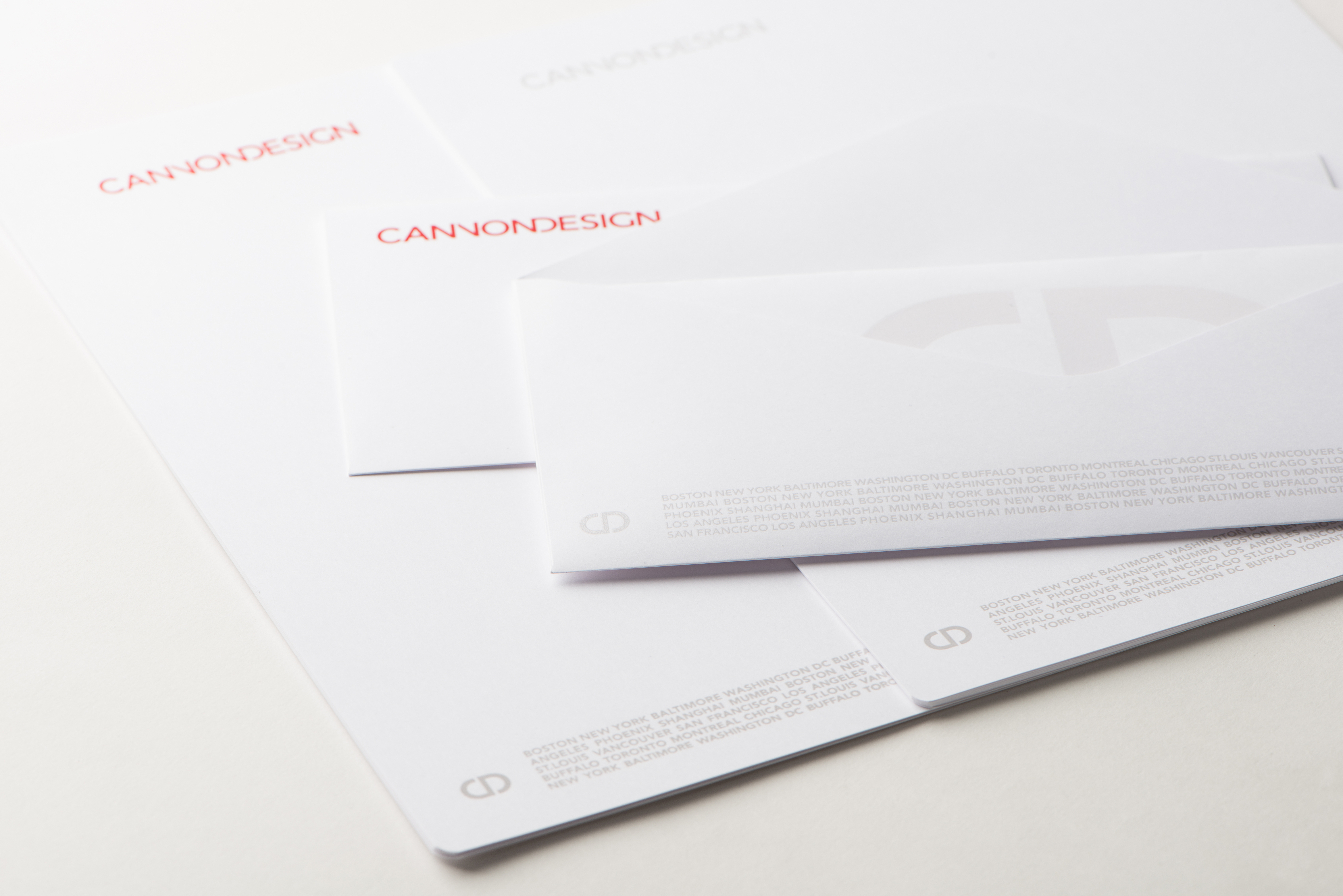
From letterheads to business cards and envelopes, adding UV-coated city names creates a unified look that gives your brand a distinctive identity your clients will remember.
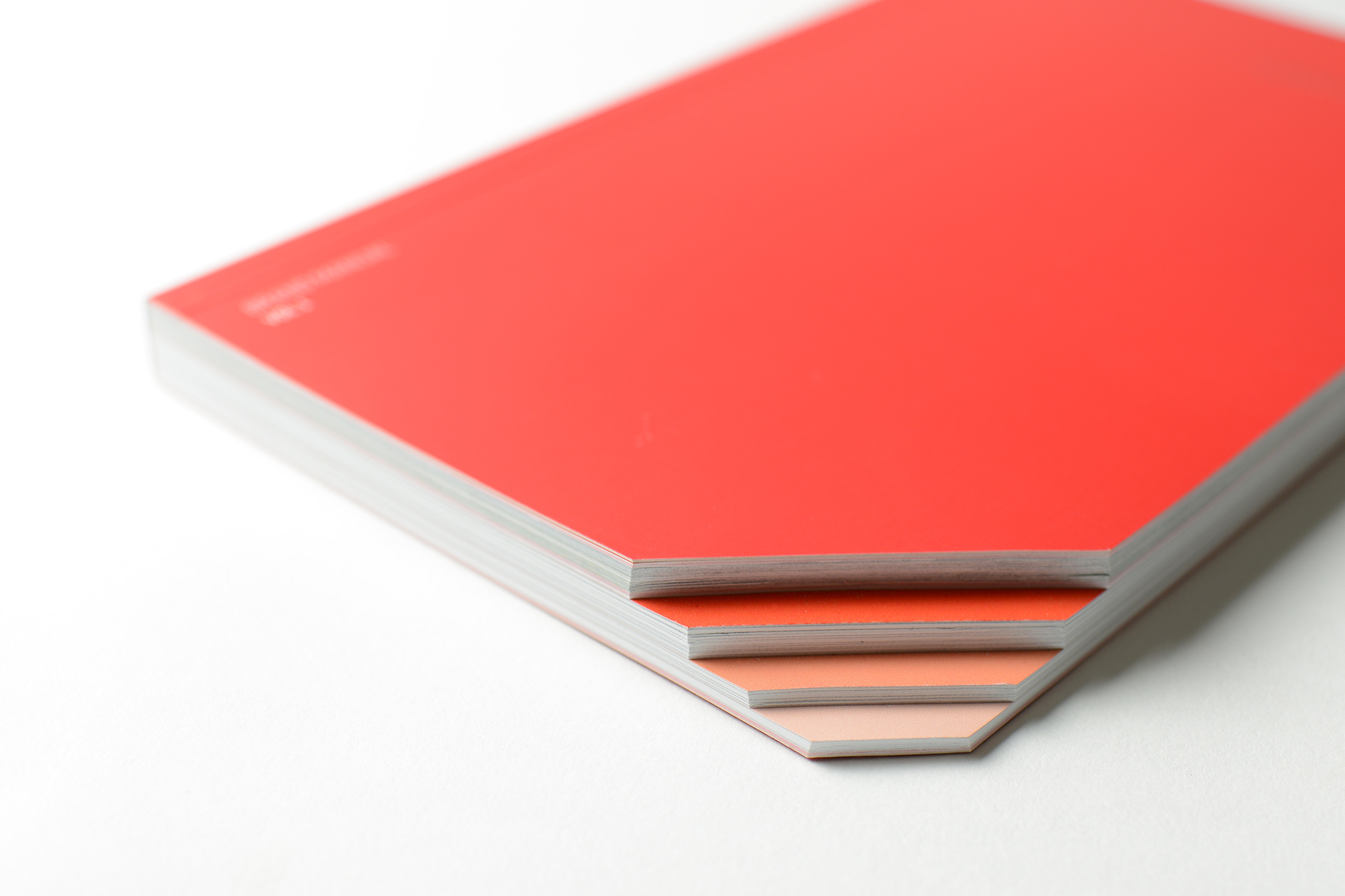
Brand Book
The Brand Book serves as a comprehensive guide, combining elements of both a manual and a manifesto. It is designed with a clear purpose: to provide instructions on effectively utilizing brand elements while also outlining the brand's aspirations.
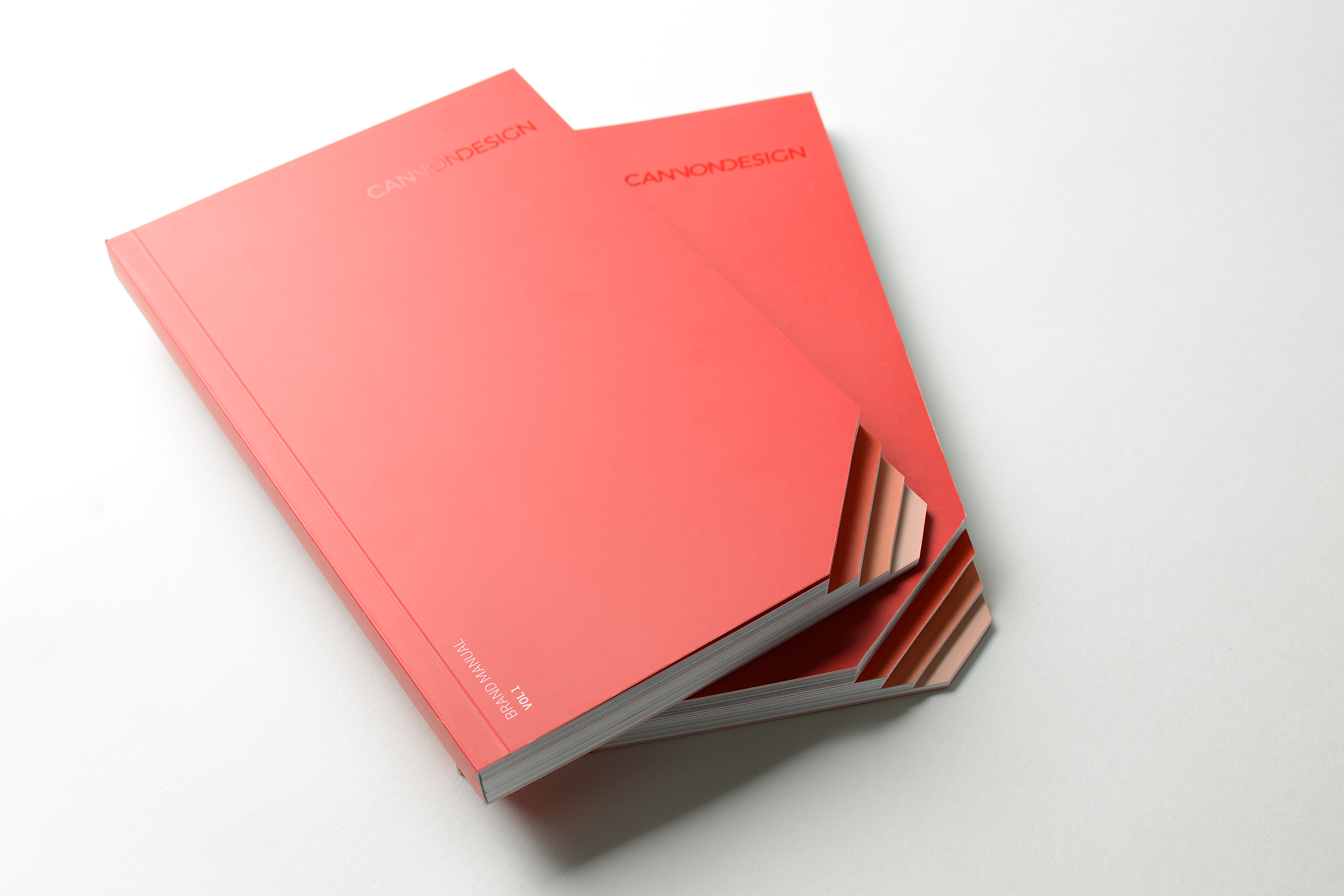
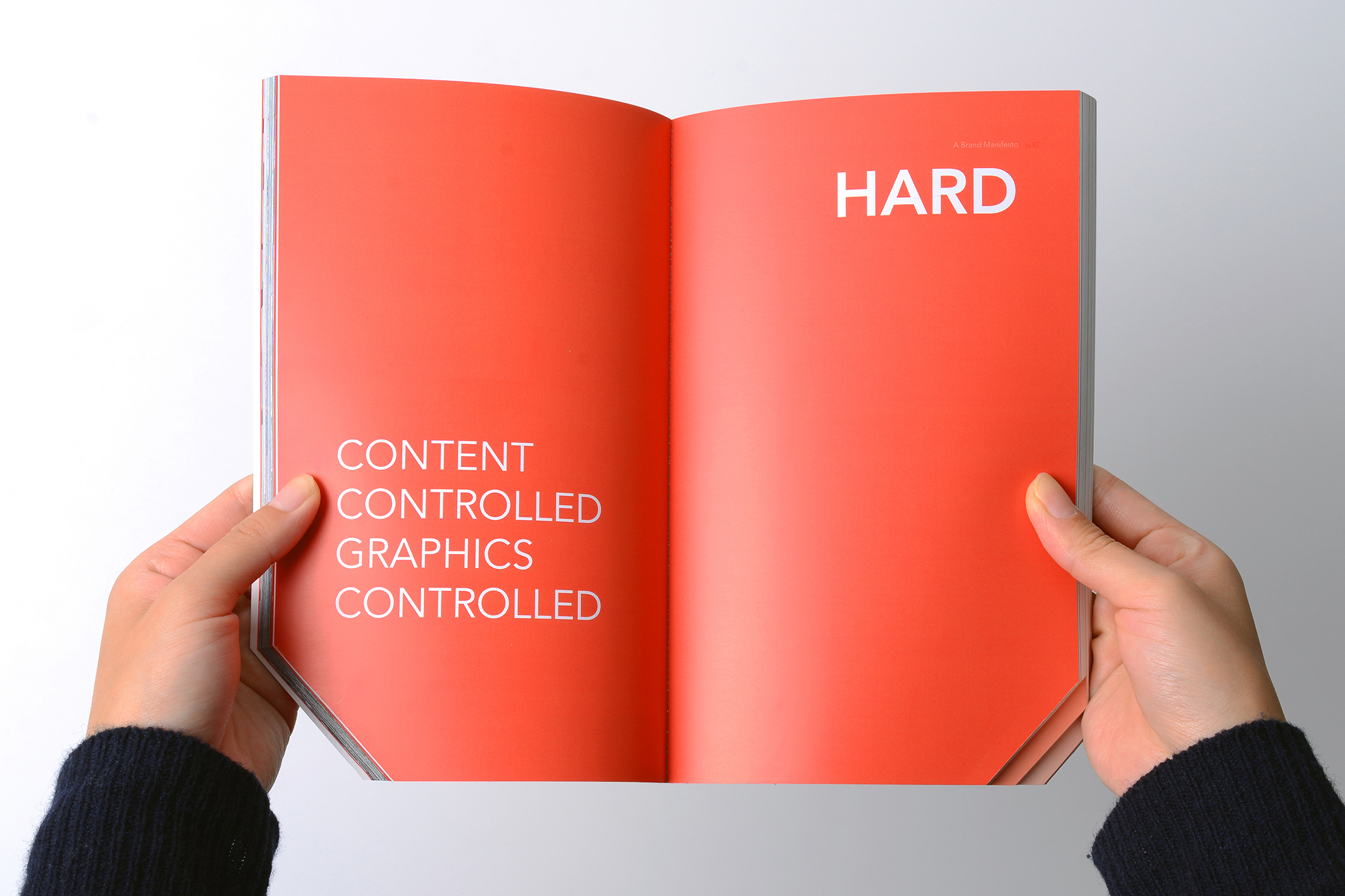
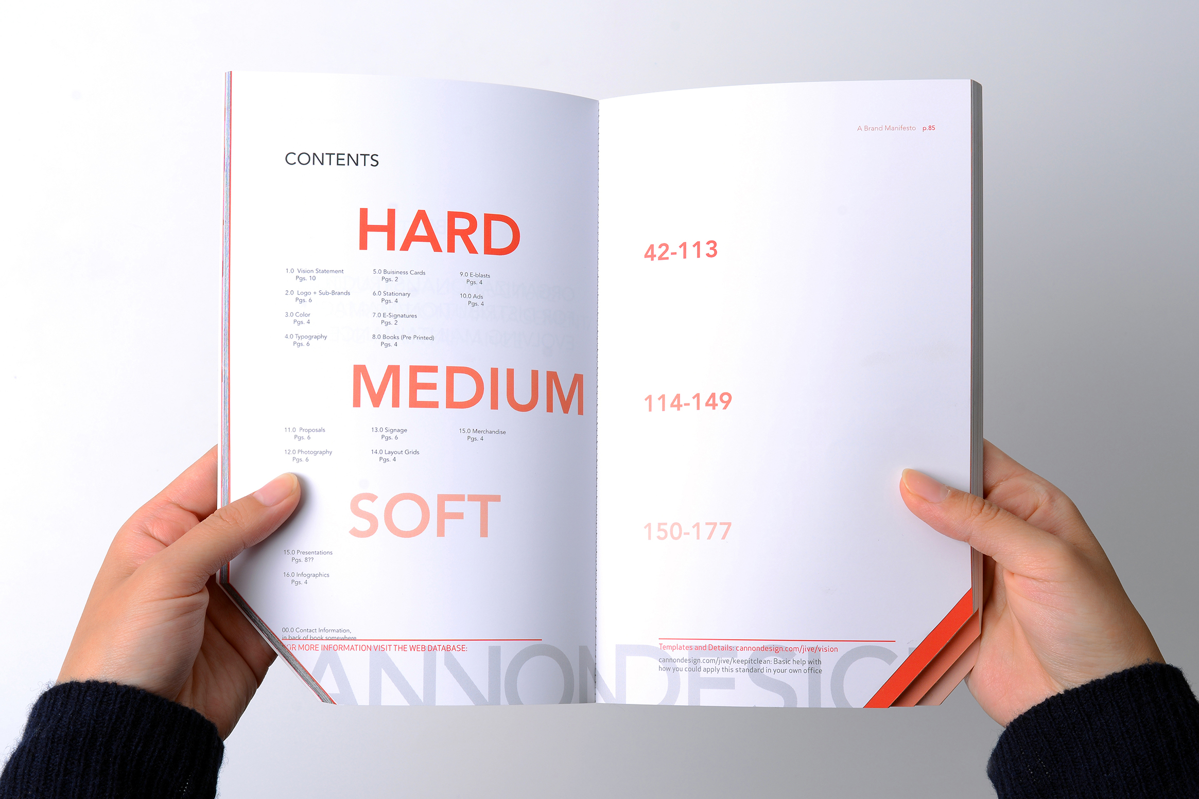
The Brand Book manual has three simple categories: hard, medium, and soft content. Hard elements like the logo stay exactly the same to keep everything consistent. Medium elements like proposals can be adapted for different situations while still following their design standards. Soft elements like presentations give you the most creative freedom, and helpful tips to keep everything looking great and on-brand are included.
This organization ensures that users of the Brand Book can navigate between the fixed and adaptable elements, understanding the importance of maintaining a consistent visual identity while allowing for flexibility when necessary. By striking the right balance between clear guidelines and creative freedom, the Brand Book empowers individuals to effectively communicate the brand's message while upholding its overarching vision.
Related Projects