LuPeng Pharmaceutical
Brand Refresh
Logos / Branding
2019
Guangdong, China
Logos / Branding
2019
Guangdong, China
Brand Refresh

Soaring progress
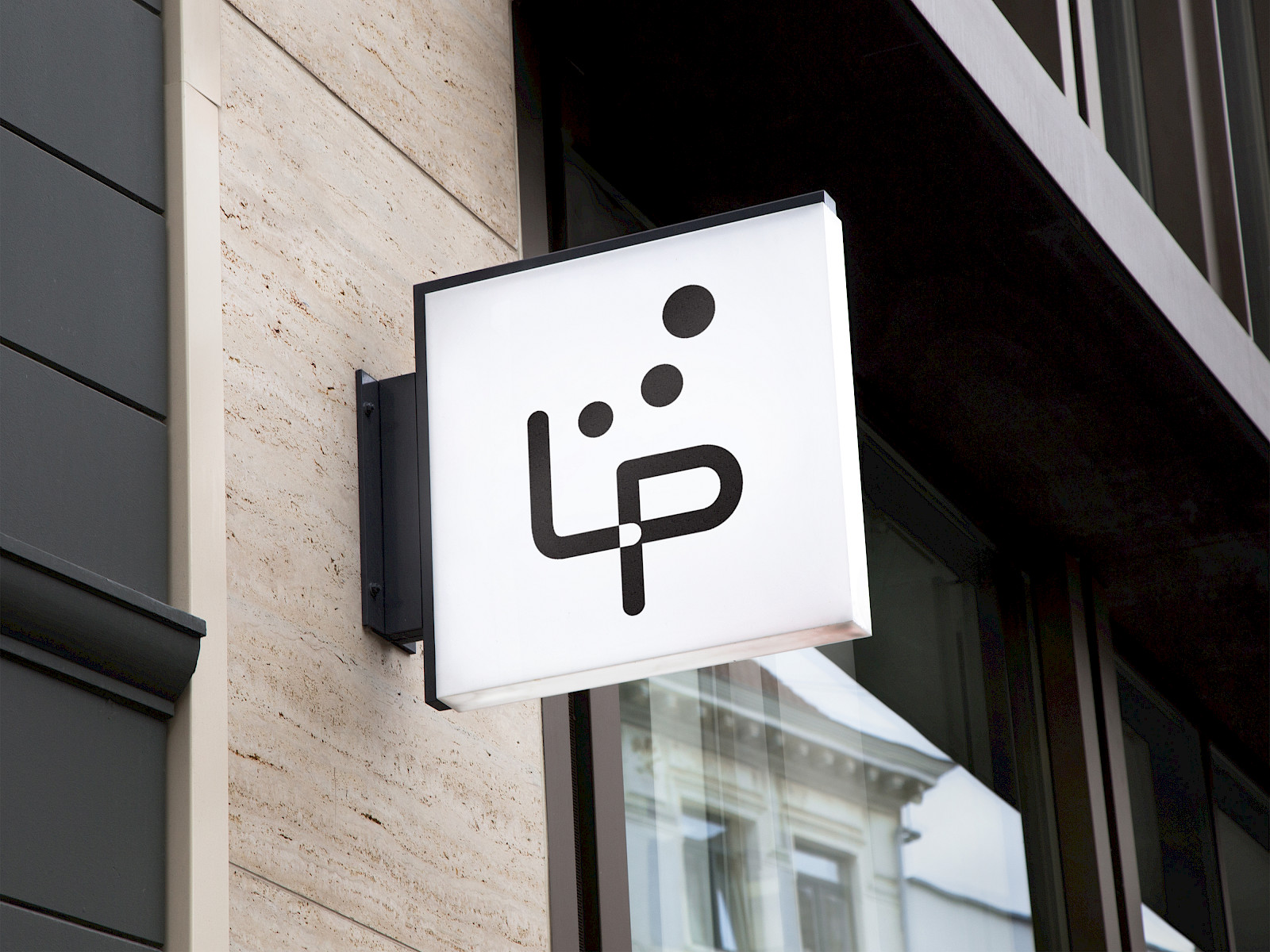
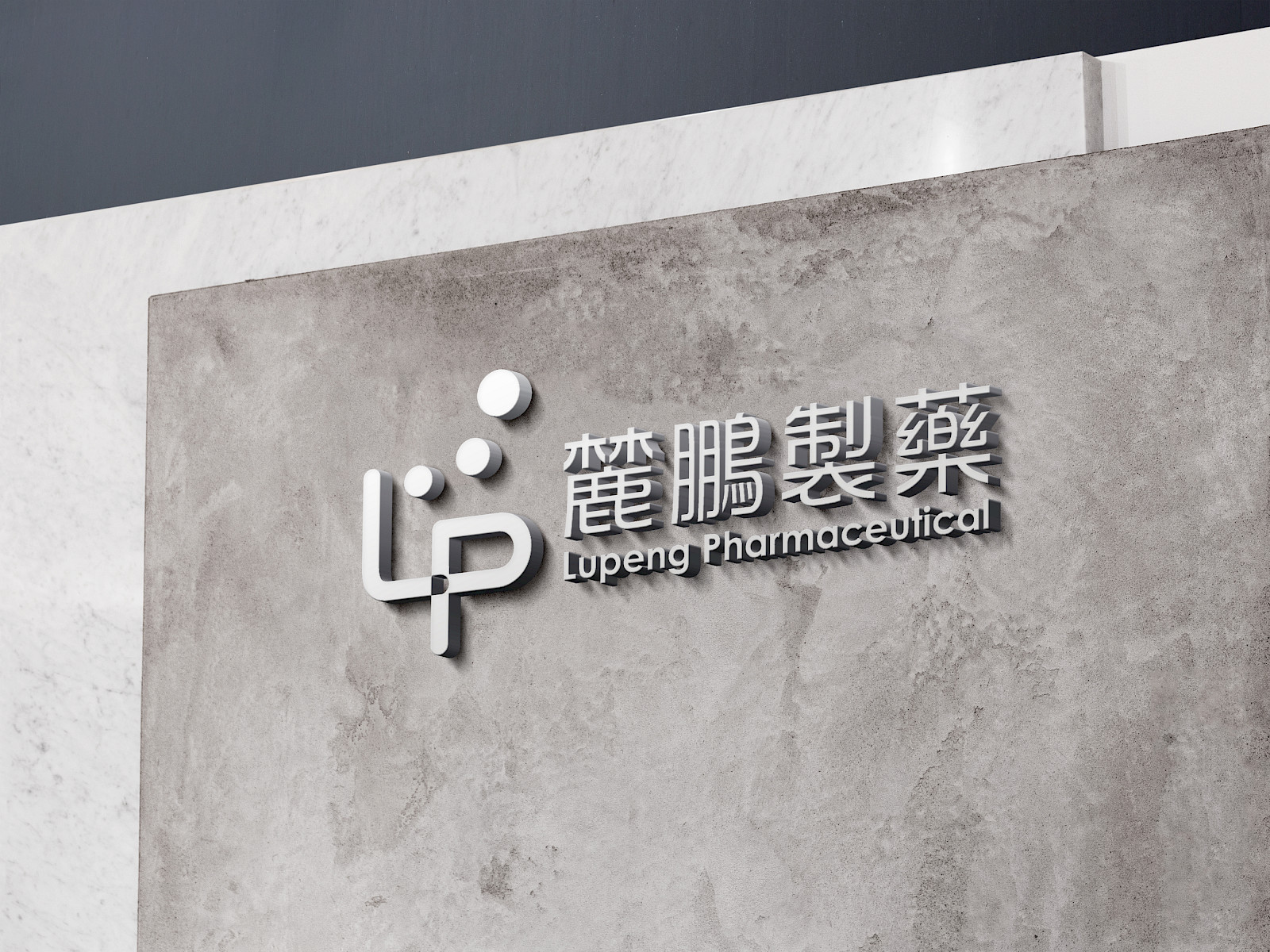
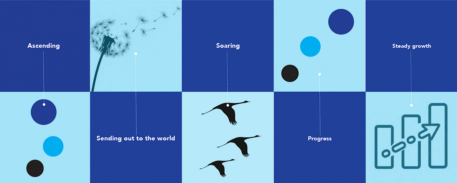
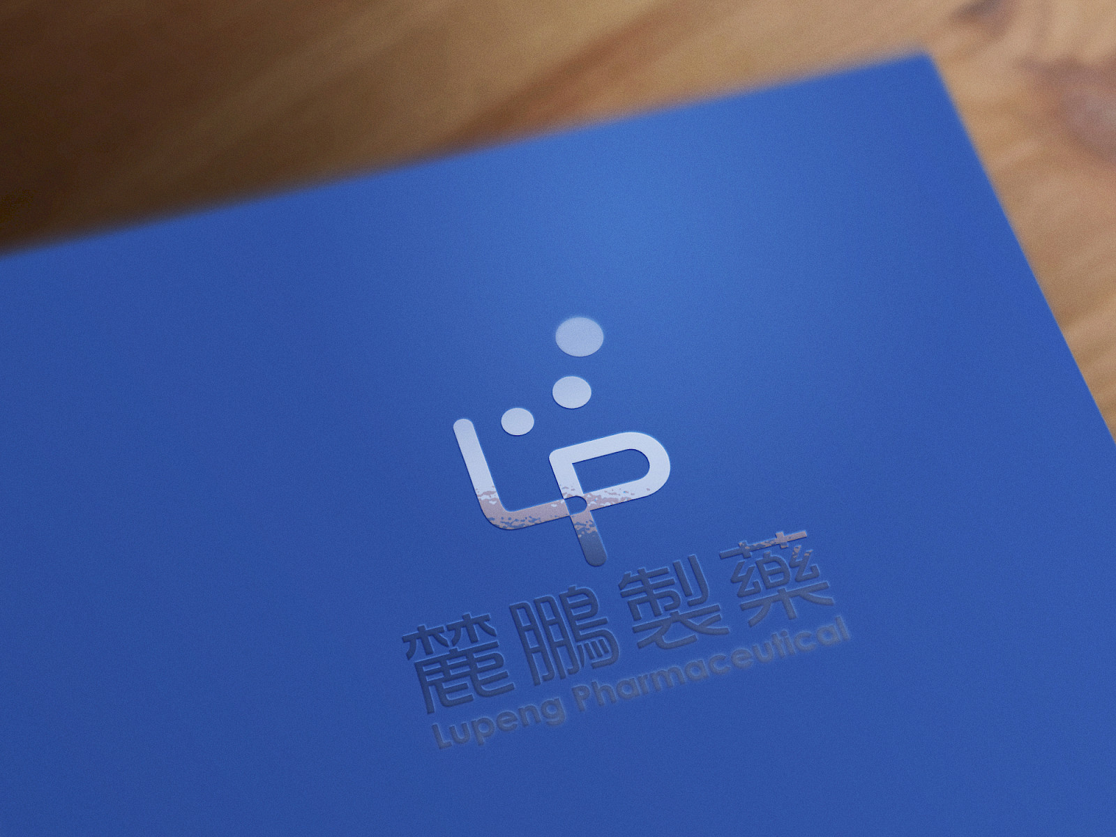
The design of LuPeng's new logo draws inspiration from the mythical Chinese bird, Peng (鵬), which is reflected in the company's name.
Symbolizing the company's vision and values, the logo portrays a formation of migrating birds, artistically represented as soaring circles in the air. This imagery encapsulates the essence of success resulting from LuPeng's unwavering dedication to producing medications that empower individuals in their fight against illness. By evoking the graceful flight of birds, the logo conveys the company's commitment to continuous effort and their mission to improve human health.
![]()
